

If you have a publicly accessible website, you'll have all kinds of devices accessing it. If your site is responsive - optimally rendering your site according to the device's screen size - each device displays your site differently. You'll want to ensure that no one encounters any problems viewing your site.
However, testing these views adds a lot of extra testing work. The number of different devices that can access your website - from desktop computers to tablets to smart devices like TVs and even refrigerators - increases by the day. How can you test all these scenarios? Is it possible to automate this kind of testing efficiently and effectively?
Why testing website responsiveness matters
Ensuring that your website is in optimal form for all types of screens, large and small, is more critical than ever.
In the days before smartphones and Internet-connected devices, there were very few screen resolutions to take into consideration, like 1024 x 768 pixels or 1366 × 768 pixels on widescreen displays. You could get away with designing your website with one of those typical screen resolutions in mind, and it would work for the most part. There wasn't much to test.
Now, not only do we have more screen resolutions thanks to advances in pixel density, but we also have more devices connecting to the Internet. It's nearly impossible to verify that a website is rendered appropriately for all these different screens.
We're also in the midst of a significant behavioral change regarding people's Internet usage. Recent studies show that over half of web browsing these days takes place on mobile devices. This behavior makes it essential that your website works well anywhere.
Providing a pleasant experience by having your website render in an optimal way for these devices helps people stick around. It minimizes the chances of someone instantly reaching for the browser's back button, losing a potential lead or custom for your business.
Responsiveness is also getting increasingly important for SEO purposes. For instance, Google takes accessibility and responsiveness for mobile devices into consideration for its ranking algorithms. If your site is not mobile-friendly, your Google rankings can take a severe blow.
An SEO-related factor that ties indirectly to responsiveness is your site's bounce rate. Bounce rates - the percentage of users that view just one page on your site and leave - are another important factor with Google's algorithms. If people go to your site on their smartphone and can't use it well, your bounce rate increases.
How bugs surface in your responsive website
Depending on how your website handles responsiveness, it's easy to have bugs under different screen resolutions to slip by undetected.
Often, page elements on a responsive website behave differently depending on the current screen size. The way your website looks and works on someone's 4K monitor may be different on someone's iPhone 11. You might even have resolution-specific functionality.
Let's use eBay as an example. On a desktop computer with a large screen resolution, the website header contains multiple elements - a menu to shop by category, a navigation header, searching by category, and advanced search options.

When you access eBay on a mobile device, many of the elements seen on the desktop computer disappear. There's a basic search field with no menus or advanced options - the rest is not available on mobile devices. Additionally, there's a banner ad on top of the site, prompting users to download the eBay app.
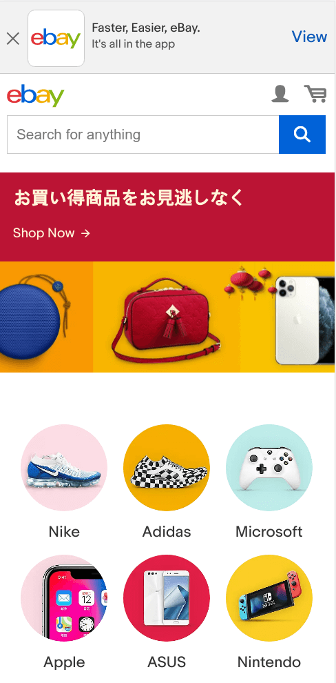
As seen here, while the underlying code of a responsive website is mostly the same, the way the site renders can change drastically. It can also change the way others use your site.
Unless you're explicitly testing the same page on different screen resolutions, there's a good chance of unexpected behavior sneaking by QA and into production. It's not enough to check in just one or two common resolutions if your website's functionality relies on how it renders in different screen sizes.
Testing your website's responsiveness
Thankfully, you and your team don't need to spend lots of time performing the redundant work of verifying the same page over and over. You can automate most of this work so you and your team can spend more time on more valuable forms of testing.
Most modern web testing tools have ways to test your website in different screen sizes. If you have an existing tool running end-to-end tests on your websites, there's a good chance it has a way to manage the screen size during test runs. For instance, if you use Cypress, you can control the browser viewport while testing. You can do the same with Selenium Webdriver.
This article focuses on using TestCafe to help you properly test your responsive website in a variety of scenarios. TestCafe has a few simple ways to test your website to ensure things work as expected for different screen resolutions.
Using TestCafe's Chrome Device Emulation
Google Chrome and its derivatives like Chromium and recent versions of Microsoft Edge contain built-in tools to simulate how a website looks in a mobile device called Device Mode. These tools allow you to set a specific screen width or use common mobile device resolutions to simulate how your site responds to those different resolutions.
TestCafe has out-of-the-box support for Chrome's Device Mode. This feature allows you to run your existing tests while simulating different devices. There are two main ways to run your tests using Chrome's Device Mode - by emulating a device or emulating a screen size.
To run your tests by emulating a device, you can specify the device when running your tests from the command line. For instance, to run a TestCafe test file using Chrome's Device Mode and simulating an Apple iPhone X device, use the following command:
npx testcafe "chrome:emulation:device=iPhone X" home_test.jsThis command runs your tests at the screen size for the iPhone X, which is 375 x 812 pixels. Note that this size should not get confused with the device's native resolution, which is three times the pixels (1125 x 2436 pixels). The device's screen uses a higher pixel density, but the effective screen size remains the same as handled by Chrome's Device Mode.
If you want to see a list of devices available for simulation in Chrome, you can find it under the Settings section of Chrome's DevTools. Depending on your version of Chrome, you'll have a list of predefined devices. You can also create your own for any specific device's screen size.
Similarly, you can run your tests by specifying the width and height of the browser's viewport, among other options. For example, to run a TestCafe test file with a browser viewport of 800 x 500 pixels, use the following command:
npx testcafe "chrome:emulation:width=500;height=800" home_test.jsThis command runs your tests by setting the browser's viewport to the specified width and height. TestCafe's documentation contains additional parameters for setting Chrome's Device Mode when running your tests. Some useful options are simulating the device's orientation (vertical or horizontal) and changing the user agent string used during testing.
Keep in mind that Chrome's Device Mode is not a substitute for real devices. These tools simulate mobile devices in some fundamental aspects, like screen resolution. But given the hardware and software differences between desktop or laptop and mobile devices, you might encounter cases where your tests behave differently in a simulated mode. If you need to ensure your site works on specific hardware, it's best to use real hardware.
For the most part, however, using Chrome's Device Mode is often enough for quick checks. If all you need is to verify that a page renders appropriately at specific screen sizes, it works great.
Using TestCafe's remote functionality
One useful yet seldom mentioned function included with TestCafe is its remote functionality. Using any device that shares network access with the system containing TestCafe, you can trigger your tests to run in that environment, as long as TestCafe supports the browser.
The way remote functionality works is by telling TestCafe you want to run your tests remotely. For instance, you can start a remote TestCafe run on your local development environment with the following command:
npx testcafe remote home_test.jsAfter running this command, TestCafe won't run your tests immediately. Instead, it creates a URL that's accessible anywhere on your local network.
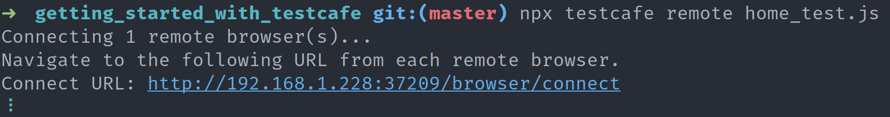
When you access this URL on any device on your network, your TestCafe tests begin running as if they were executing on your local development environment.
As you might guess, this functionality is perfect for testing on mobile devices. All you need to do is start a remote run of your TestCafe test suite, grab your mobile device, and enter the URL provided by TestCafe. Your entire test suite executes on real hardware.
If you noticed in the screenshot above, the URL is a bit long. Admittedly, it's a pain to type by hand, especially on a mobile device. Fear not - TestCafe helps you out by providing the --qr-code flag:
npx testcafe remote home_test.js --qr-codeAdding this flag does the same as before. TestCafe generates a URL you can use to run your tests on other devices in your local network. However, this time it also gives you a handy QR code you can scan with your device. All you'll need to do is scan the code and open the URL - no need to type anything.

Keep in mind that the URL generated by TestCafe only works if your device is on the same network as the system where you execute the test suite. There are ways to access this URL outside of the local network, like SSH tunneling or setting up a VPN. But that's out of the scope of this article.
Using BrowserStack with TestCafe
If you need access to real mobile devices that you don't have readily accessible, a good option is to use BrowserStack. BrowserStack is a testing platform with access to a variety of environments, including real hardware. You can run your tests on most major mobile and tablet devices for both Android and iOS without emulation.
There's an article on Dev Tester covering BrowserStack and how to use it with TestCafe, so I won't cover the details here. Please read the article for additional information on getting started with BrowserStack and how you can use its real devices for testing.
In most situations, you can do enough website responsiveness testing with Chrome's Device Mode or TestCafe's remote functionality. But in the times you do need to test on real devices, BrowserStack can help you without needing to invest in a hardware lab.
Summary
In today's Internet world, more people are browsing the web on their mobile devices. If you want people to find and use your website, it's crucial to ensure it's working correctly across a variety of screen sizes.
Having a responsive website increases the surface area to test. It can take plenty of time to ensure your pages work under different screen resolutions and devices. However, you can automate a lot of these tests to ensure the most critical areas of your site work, no matter the device or screen size.
Most web testing frameworks have ways to test your website in different screen sizes. TestCafe includes some easy and built-in ways to automate these tests, including the ability to quickly test on real devices.
Leveraging these tools can help keep bugs related to mobile responsiveness out of your website. It also spares you and your team from the need to spend tons of money and time on manual testing.
What techniques do you and your team use to ensure your website works in different screen sizes? Leave a comment below and share your tips!
Want to boost your automation testing skills?
With the End-to-End Testing with TestCafe book, you'll learn how to use TestCafe to write robust end-to-end tests and improve the quality of your code, boost your confidence in your work, and deliver faster with less bugs.
Enter your email address below to receive the first three chapters of the End-to-End Testing with TestCafe book for free and a discount not available anywhere else.